Framer
I created a website in Framer to showcase my design and music projects. An introduction to who I am as a person and what design means to me.
Less is more
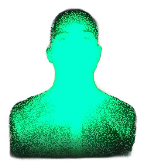
It felt uninspiring to see all the pixel-perfect, black-and-white portfolios from designers today. No template in Framer felt honest or personal enough for me as a UX student or musician. So I took a very simple template and rebuilt it from the ground up, to create a website that is 100% Axel. With a dithered profile picture that stands out paired with a color theme that reflects my digital Lo-Fi music, I clearly express my visual identity with as little means as possible.
Colors, typography & information
I like the color green, as you may have noticed. A challenge for me was to use it throughout the website without making it hard to read.
Headings have been given different shades of green, where H2 is a vivid green and progressively paler shades carry down to H6. H1 and body text, reserved for the most important content, I made white for maximum readability against the dark background (Accessibility).
The information hierarchy is therefore conveyed not only through size but also through color, something that makes it easier for visitors to read the page and ensures they pick up on the most important information.
Interaction
I have constantly kept Affordance in mind when it comes to the interactions in my portfolio. Virtually everything clickable has been made clear through animations on hover/click (scale, position, color change) as feedback. Even a fairly minor Pain Point like a traditional mailto: link for email contact, which often sends you to the wrong application, has been replaced with a Copy-to-clipboard function. My goal has been an experience as Frictionless as possible.